Role: Freelance Graphic Design
Duration: Ongoing
Tools Used: Adobe Photoshop
Duration: Ongoing
Tools Used: Adobe Photoshop

Project Overview
RDY Accounting & Advisory required a logo that felt professional, recognisable, and understated; reflecting the nature of the accounting industry while still standing out in a competitive corporate landscape. The goal was to create a timeless visual identity that could be easily applied across digital and physical touchpoints.
RDY Accounting & Advisory required a logo that felt professional, recognisable, and understated; reflecting the nature of the accounting industry while still standing out in a competitive corporate landscape. The goal was to create a timeless visual identity that could be easily applied across digital and physical touchpoints.
Concept & Direction
Inspired by established accounting brands such as PwC, EY, Deloitte, and Grant Thornton, the logo focuses on abstract simplicity rather than literal symbolism. The aim was to create a mark that feels recognisable through form, colour and consistency alone.
Inspired by established accounting brands such as PwC, EY, Deloitte, and Grant Thornton, the logo focuses on abstract simplicity rather than literal symbolism. The aim was to create a mark that feels recognisable through form, colour and consistency alone.
Design Solution
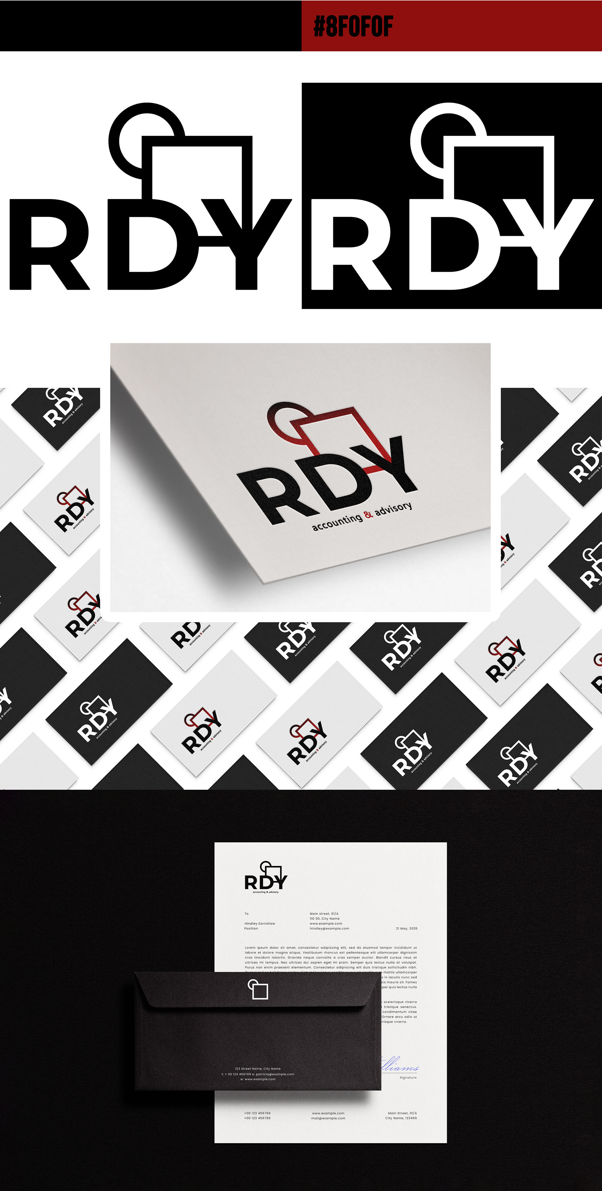
The final logo features the initials “RDY” set in a clean, highly legible typeface. A square format was chosen for versatility across web, business cards and merchandise. A restrained colour palette with a red/maroon accent adds subtle personality while maintaining a professional tone.
The final logo features the initials “RDY” set in a clean, highly legible typeface. A square format was chosen for versatility across web, business cards and merchandise. A restrained colour palette with a red/maroon accent adds subtle personality while maintaining a professional tone.
The design was tested to ensure it remains effective in black and white, at small scales and across various print surfaces.
Outcome
A timeless, minimal logo that balances credibility and clarity; designed to age well and adapt seamlessly across branding touchpoints.
A timeless, minimal logo that balances credibility and clarity; designed to age well and adapt seamlessly across branding touchpoints.